CLICK HERE FOR FREE BLOGGER TEMPLATES, LINK BUTTONS AND MORE! »
Showing posts with label craft. Show all posts

Friday, July 29, 2011

Fine is never enough...

Once again, I finished something, my pantry in this case, and it wasn't good enough.  I had this: pretty but not what I wanted.

What I wanted was this...


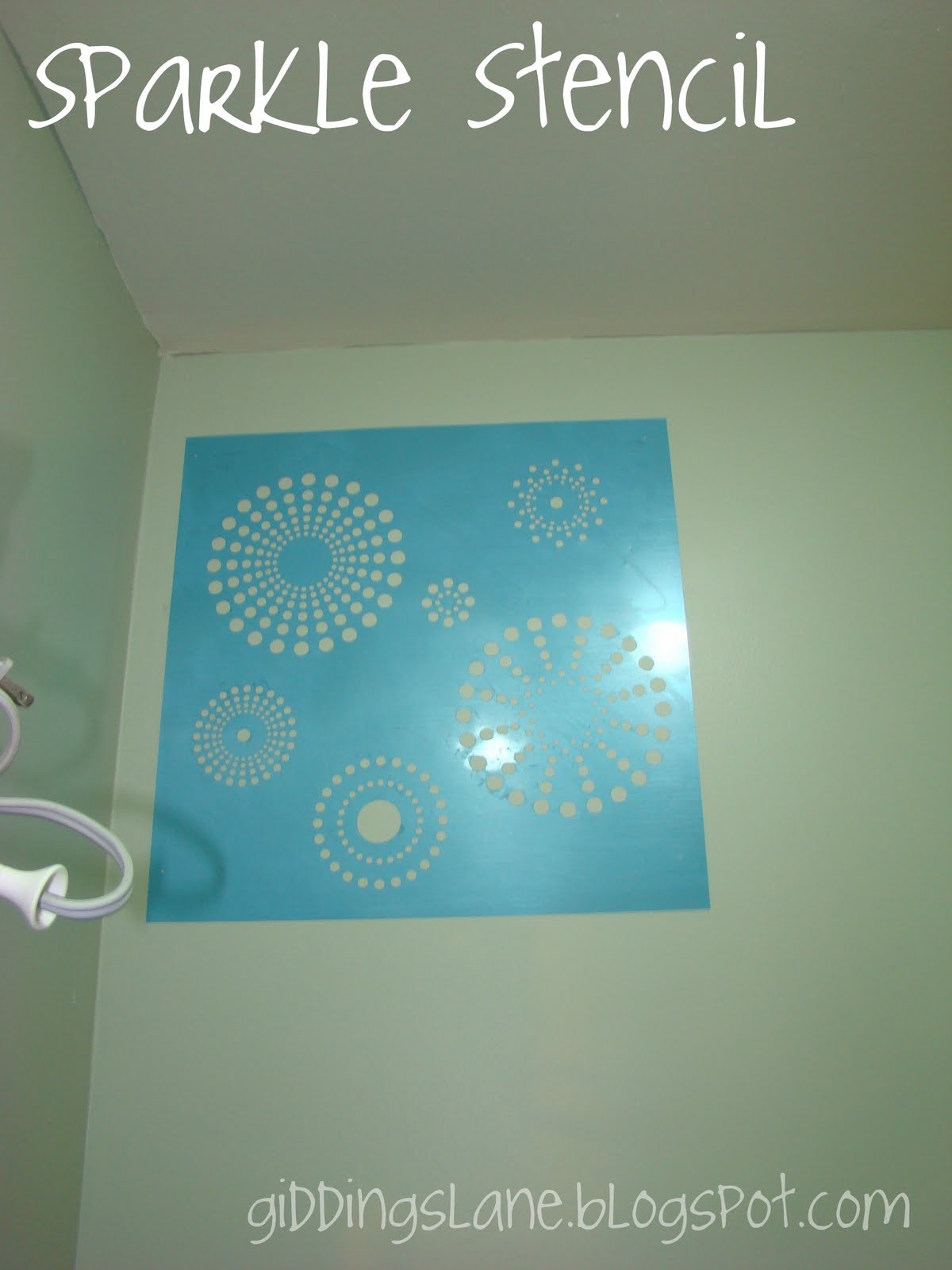
See the pretty pattern in the background?  I love it!  It makes a utilitarian room special.  After cruising the post on how it was done (click the pic to see) I realized what looked painted was instead vinyl.  I didn't have the funds to do vinyl, nor the patience, but man did I want the look!!  So, I cruised the internet for alternatives.  That's where I landed on this.


So pretty!  Just a little feminine with a twist.  Not too fussy.  It was perfect in every way except one, the price.  At $40 it was out of my range.  So, I went to work.  Hobby Lobby had wall stencils and furthermore I had a 40% off coupon which brought the $17 cost down to my price range, especially if I hated the look after it was all said and done...  So, I purchased a stencil that I thought looked like me and experimented.


A few notes here:

-everyone always talks about using stencil adhesive or spray adhesive or painter's tape.  I'm telling you to use ALL of it!!  They are not really interchangeable (okay, maybe you could use spray adhesive or stencil adhesive interchangeably.)

-Do not FORGET the blue tape.  Do as I say, not as I photograph or you'll be sorry.  Trust me, having the stencil stick to the roller, come off the wall, fall back on the wall, and then hit the floor causes "dirty word" to spring from your mouth.  (yes, I usually use "dirty word" instead of actual dirty words because of my job.  it helps when I get mad or drop something at work.  that way i don't let a true bomb drop.)

-Another tip is to use a foam roller and roll the roller in one direction only instead of back and forth.  It helps with the bleeding thing.

Anywho, after the learning curves, I ended up with this.


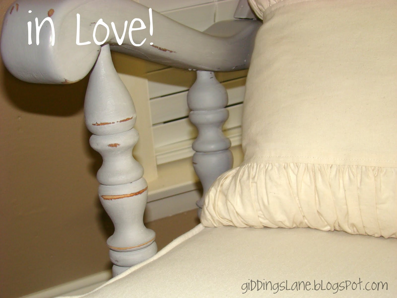
I'm in love!  (although, i am slightly worried about it.  the pattern is only on two of the four walls in the pantry and seems a little overwhelming.  maybe with the addition of shelves, it will calm down the overall look.)

Here is a look at the walls when you walk in.  I still love it despite my fears!!

Monday, July 11, 2011

Sit a Spell

At my last garage sale, my SIL brought over her beloved rocking chair from her aunt.  Because of a combination of the "fabulous" (sorry Aunt Jackie) look of the chair and the fact that my nephew is perfecting his mountain climbing skills, my SIL felt that she had to sell the chair.  I knew she loved it, so I told my bother to put it back inside.  I knew that with a little love and sweat, the chair could be beautiful.  (Unfortunately I couldn't and still can't do a thing about Zach's climbing ability.)  Did I mention the look of the chair was straight out of the 60's? 


Isn't it pretty?  Yeah, not really in the vein of my SIL's house.  (Again, sorry, Jackie.  It does have  great bones though!!)  In case you're missing part of the glory, check this out.


Yup, it featured every great color that WAS in my house before its transformation.  Scary.  Anyway, it plunked itself in my living room and sat there for almost six months before I got around to transforming it.  Hey, I said I'd do it, I didn't ever say it would be fast!  ;)  

I typically am a big fan of the Behr Ultra paint.  So much of a fan in fact, that I know Guy and Suzanne on a first name basis at local Home Depot.  I love the low-ish odor, easy clean-up and so far great wearing paint, but I didn't think it was right for this project.  Okay, so maybe part of it was I didn't think it was right and part of it was the fact that I was desperate to jump on the chalk paint bandwagon.  

In case you have missed all of the blog buzz about Annie Sloan Chalk Paint, I'll give you the short version.  Chalk Paint is an all natural paint with NO, yup, no odor which dries to a super matte finish.  It requires no sanding, striping, priming or other prep work.  If you've ever tried to sand anything, you will understand my immediate interest in chalk paint.  Add to that it's an English product that allows the under thing, whether wood, metal, glass, brick, cinder block, whatever to breathe and I was hooked.  And after a little research, I found the price.  Ouch.  It's not cheap stuff folks.  At almost $40 a quart, this cheapie was a little shell-shocked.  It didn't take me long to convince myself that the paint was worth the original cost, but not shipping.  (I really HATE to pay shipping on anything!  Yes, I'll spend twice as much on gas, but I digress.)

So, after checking the state side suppliers, I found one in little ole Waco, TX.  Imagine!  It's one of 3, yes 3 in the entire state.  I did some sweet talking of my mom and Mimi and they graciously picked up a quarts of Old White and Paris Grey for me.  It is a probably a good thing that I didn't go because I'm sure I would have come home with way more than two colors.  (Scroll down on the link to see the best representation of all the available colors I could find.)

My mom decided she would use the Old White to redo the daybed in her "kids' room."  Because I had no idea how far this paint would go, regardless of what is online, I went with the Paris Grey for the rocker.    In true Sissi fashion, which I could blame on the 3 digit heat, but since I do the same in winter I can't, I plunked the rocker down in the middle of my living room on some leftover plastic dropcloth.  In one evening, I was able to double, yes double coat the entire rocker, complete with flipping it different directions for total coverage and wax the whole piece.  When the paint first dries, it is very, very matte with somewhat obvious brush strokes. 


Since I get brush strokes on every stinking thing I paint, this doesn't surprise me in the least bit.  I'd blame it more on the painter here than the paint.  But, anywho, the paint covered the finish nicely and and worked great.  After the paint was dry, I put a coat of Johnson's wax on it and buffed it to a shine.  I also used 220 grit sandpaper to knock down the brushstrokes and add a little wear and tear to the piece.  My goal was to make it look like it came out of a French farmhouse.


While the chair was only an evening's worth of work, the cushions were a different story.  I went with the same neutral fabric that is elsewhere in my house.  Thankfully I was able to squeeze all the pieces out of scraps left over from Elphaba and slipcovers.  I made easy to clean covers that zip on and off since I know better than to think they'd stay clean for long.  For picture purposes, I grabbed my ruffle pillow and it fit perfectly.  Since it's currently destined for Zach's room, the ruffles aren't a permanent thing, but I'm on the lookout for a train pillow.


In case you need a refresher...
 Not too shabby I'd say!


(All opinions are completely mine and I haven't been paid for them!)

Friday, July 1, 2011

Outlining Letters

I've had a couple emails asking how to make your font in outline form, so I thought I'd throw in a quick tutorial in case you feel inclined to try your hand at "P.L.A.Y."  All of these directions and screen shots are for a Mac and Word.  I'm assuming that it's similar to Windows and other word processing programs. 

Choose whatever word or letter that you like and put it into capital or lower case letters.  Whatever you want your final product to be.  Highlight your word or letter or all the formatting you do won't effect your letters.


Once you have your words highlighted go up under the format menu and select Font.  This should open up another menu.


In the box that launches, check the box next to outline and then choose a larger size to really "see" the font in outline form.


This isn't the size that you're going to use if you want a letter per page, but it will let you pick the font that you like best in outline form.  Once you choose your font, select okay.


In the toolbar, hightlight the actual size that the letters are and change it to whatever you like.  I start with something simple such as 200 and go up and down from there until it gets close to what size I want.  Keep in mind that just because you use a size 200 in one font doesn't mean it won't take a 300 to fill the same size space in another font.  See the example.


Once you get the size you want, center the letters to make alignment easier and then print.  Enjoy!

Wednesday, June 29, 2011

P.L.A.Y.

Sometimes you just need to add a little fun to your life and when I saw these precious monograms at Dollar Crafts, I knew they were just what I needed for my playroom.


Granted, I had no need for my initials up all over the walls of my playroom, but I could switch it up and use the word "PLAY."  I started by printing out a favorite font in an outline version as large as I could go on one regular sheet of paper.


Once I had those printed, I scrounged around at work and gathered as many shades of blue and green crayons I could find, not caring about the brands, just the colors of the paper wrappers and crayons.


Then, I roughly measured the crayon on the outlined letter.  Using a sharp knife, roll the crayon back and forth using light pressure until the crayon snaps. (I just noticed that I did a section with no paper.  Oops.  I used the wrapper sections because I knew the glue would adhere better to the paper than the wax.)


Line up all of the pieces of the crayon on the outlined letter, making sure to dry fit everything. 


Sorry for the pic quality here, it was slightly late when took these.  Once the entire letter was filled, I transferred it piece by piece to a blank sheet using my very technical TV remote to position my letter.


I made sure to get glue behind the crayon and also on the sides where it touches another crayon.  Because I framed these without glass, I wanted them to be secure on the wall and not fall on anyone's head.  (It's raining crayons, halleluiah, It's raining crayons!?!)

Once that was done and the crayons were completely dry, I trimmed the paper to fit in a standard 8x10 frame that I scored at Micheal's for 60% off plus an additional 25% coupon!  Thankfully they were already white so I could skip the spray paint step. 


I did put a couple of glue dots in the top corners to hold the paper up in the frame in case it wanted to slide down and/or out. 


I think it looks pretty cute and could easily be altered to other crayon colors, dowel rod pieces or anything else long and narrow.  Oh, there is the matter of that small mess behind the PLAY, but that's another blog for another day.


NightOwlCrafting


Friday, February 4, 2011

A Bit Flakey

After perusing blogland, I came upon this fabulous creation. I love the simplicity of it. RACKS & Mooby did a great job. As a Christmas accent it's really cute and simple, but I wanted something that would last longer than just December.


Besides, around here we RARELY get to see any of the white stuff. Just doesn't happen. (We have had some, but never more than 1/2 inch so we only experience the romance of snow, not the mess.) Even if I have to frame it on my walls, I want to see snow.

Off to Michael's I went. I too hit their sale stuff and picked up plenty of foam snowflakes of various shapes, sizes and glitter! (Love me some glitter...) I decided I wanted to put my flakes up in the same place I put my Halloween "decorations."

After getting more of the same blue shimmer paper I laid out my flakes dry fitting them before breaking out the glue. (A big thanks to Zach for helping Sissi with this project! I had snowflakes everywhere!)

Because my foam was going to be behind glass, I didn't worry too much with foam glue. Instead I used my trusty Scotch Quick Dry. I use this stuff for all of my scrapbooking and really recommend it. (Nope, not getting paid by anyone, just sayin'.)

After getting everything set just so, I repeated my design 4 times. Hey, I was tired and didn't feel like being original each time. Sometimes, there is no need to reinvent the wheel and that's okay! I love the final look.


What's really funny, is that when I put up the flakes, I flipped some of them upside down. Oops. While this goes against my anal tendencies, it really hasn't bothered me too much and I'm living with it just fine. Imagine!

Please admire the cleanliness of my living room. I promise you it was picked up specially for this picture and returned to "normal" shortly after it was snapped!

Saturday, January 15, 2011

a fitting wreath...

My front door Christmas wreath was gorgeous, but I don't want to be known as one of "those" neighbors, so down it came on January 1. That left me with a blank white door, not exactly my style. I know that ornament ball wreaths have been all over the internet for some time now, but for those of us just joining the party, it's new to me! So, after gathering tons of silver, gray and white ornament balls, most covered in glitter, I went to town with the glue gun. By the way, no one mentioned how many sticks of glue you use on the projects! Granted, I may have been making it wrong, but I was thinking it was kinda self explanatory. I will stick in a personal note here, use the shatter resistant balls and yes, I speak from experience. After an evening of shows, whichever you prefer, and a bajillion glue sticks, you'll have something similar to what is shown below. I added a silver mesh ribbon to hold it up on the door and called it a day.
Thoughts?

Monday, January 10, 2011

Flakey Cards ;)

I love using my Cricut to make cards and now that I have a Gypsy, the possibilities seem absolutely endless. In one of my previous posts, I showed how I used my new super Gypsy, (insert super hero theme music here) to cut several trees and flakes. Wondering what I did with them??? Wait no more! I pulled papers from my arsenal, and yes, I could quite possibly fight a battle with the amount of paper I have and glued the down my trees and thank yous (also cut with the Cricut.) While I liked the look, once on top of the white card, it got lost. So, out come my chalk inks. I edged the paper in dark purple and found a shimmery dark brown cardstock and cut a shadow piece for the back. The fabulous damask embossing look was on the original paper I used. This made the overall look stand out, but it was still missing something. Hmm, what's a girl to reach for? Do I hear Rhinestones? Anyone? Anyone?? Of course! Instead of just stopping with the pretty cut-outs, I took it several steps farther and added paper layers, inking and rhinestones. One of the reasons I love cards has to be the fact that I can craft and craft and if I go overboard and don't like the look, I haven't destroyed any pictures or wasted an entire 12x12 page of materials. See, less guilt with cards! I do have to say though, if I don't like my "finished" project, I usually find that I haven't added enough details, ink, bling, texture, to the piece. For the snowflakes I cut, I used similar techniques: edging with silver chalk ink, iRock rhinestones and layering the papers. I did go one step farther and break out my Cuttlebug. (A cuttlebug is a pressure embossing system that sandwiches a piece of paper between two textured pieces. You roll the sandwich through and out comes an embossed piece.)
The piece on the left is the plain paper put through the Cuttlebug. The piece on the right has been hit with a 220 grit sandpaper to show off the inner white core of the cardstock. Love it!! Once the cardstock was prettified (love that southern drawl) I added my other layers and called it perfect! Had to mix it up just a little! So what do you think??